Running a business website can be a juggling act. As time goes on, more and more moving parts get added to it in order for it to be helpful to the business. This goes double for ecommerce websites with online stores that generate the revenue.
At times, those moving parts—various pages in the website—either fall off the wagon or simply vanish due to being no longer relevant or wanted. They go missing and you end up with 404 errors. Most of the time, that’s seen as a bad thing.
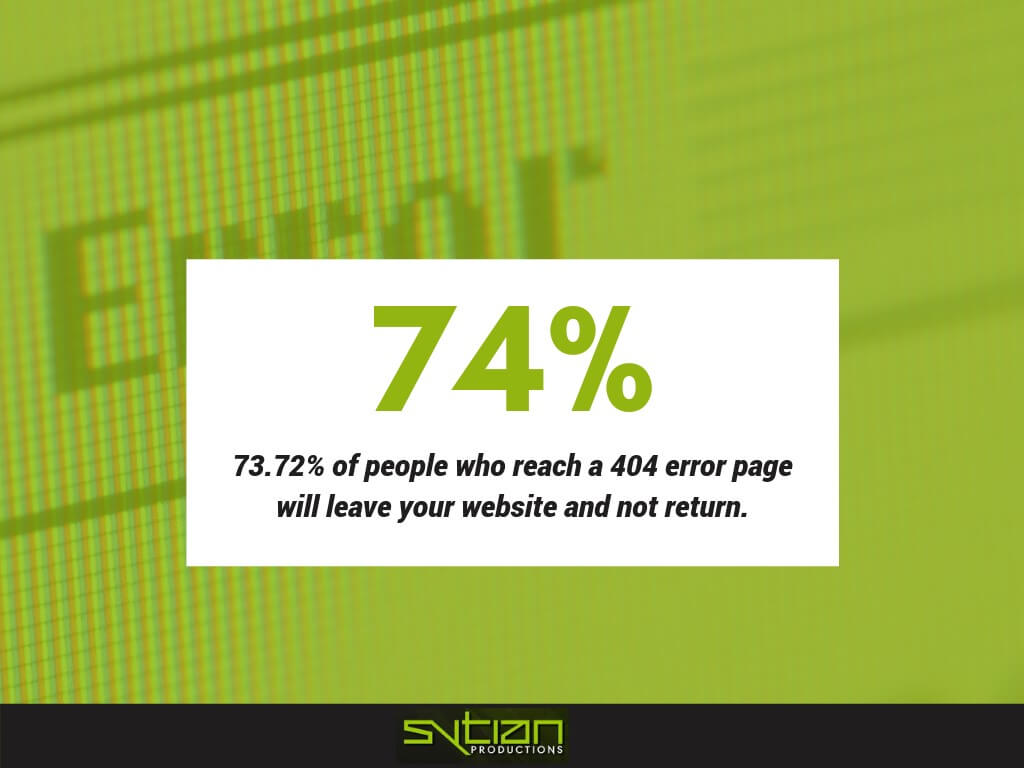
74% of people who reach a 404 error page are likely to leave your website and never return. Simply put, addressing 404 errors has a huge impact on your website’s overall performance.
As a web developer, you need devise to make 404 pages work to your favor. It’s one of the best examples of making lemonade out of lemons, and learning these techniques can be beneficial to your website and even the business itself.
Here are 10 brilliant 404 page ideas to actually increase conversions and boost revenue.
Simple 404 Page
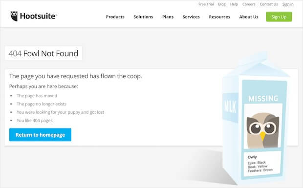
The simplest method is to simply make a custom 404 page so visitors don’t just get their web browser’s default 404 error screen that looks like a dead end and can turn away most people.
This is best if you don’t really get a lot of 404 errors on your website. This is a “make it and forget it” solution that is, at the very least, better than just having a dead end.
It just goes with your web design, so you still have your navigation that visitors can use to look for other things. You can also have something like a “return to homepage” link or button to further convince them that it’s not a dead end at all.
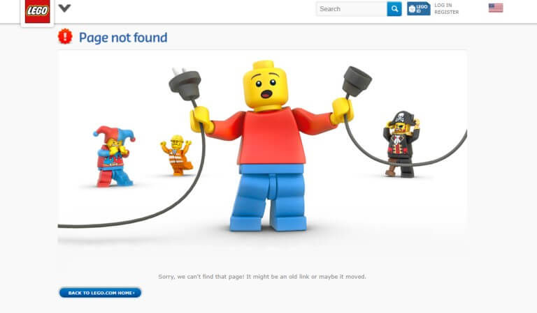
You can put an image as well to add more to it. It can be a photo or illustration that’s appropriate to the 404 page. It can either be intended to amuse, instruct, or simply placate the audience.
Do take note that while this does make it a bit better, it’s still pretty much a dead end that tells the visitor to turn back. If you can make it creative or unique, that can make it a bit better.
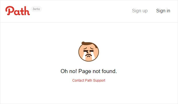
If your main goal with your 404 page is to have users report problems to you, then a simple 404 page is best with a link to contact website support.
On-Brand 404 Page
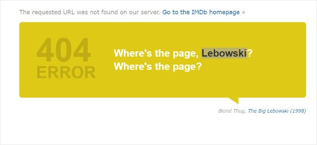
Take the principle of the simple 404 page and expand it by making it serve your branding. The difference here is you put more effort into adding an on-brand message on it.
Instead of just making sure you don’t have a hard dead end in your website, you add something that can increase brand familiarity and recognition. It’s not much, but it can still help.
Funny 404 Page

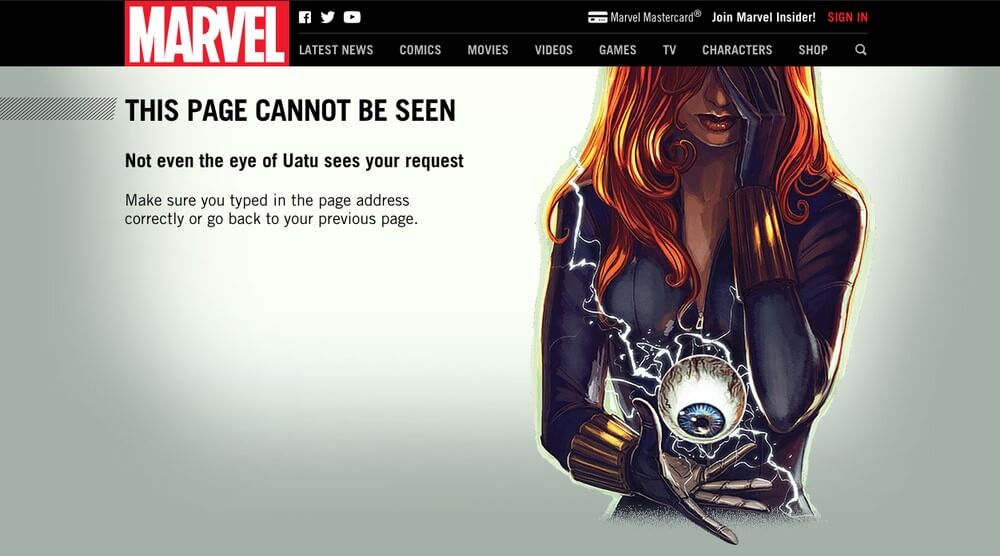
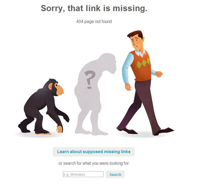
Add a bit more to your simple and on-brand 404 page by adding some humor to it. You can show that you like a good chuckle and you certainly want your visitors and customers to join in on the fun.
This is best if your brand has humor in it to begin with. You can endear your brand to people by having a funny and amusing 404 page that somewhat pokes fun at a 404 error—which is usually seen as a bad thing.
It’s yet another way to turn a negative into a positive. A successful business is one that can do so in even small ways. After all, a website does better if it entertains.
Interactive 404 Page
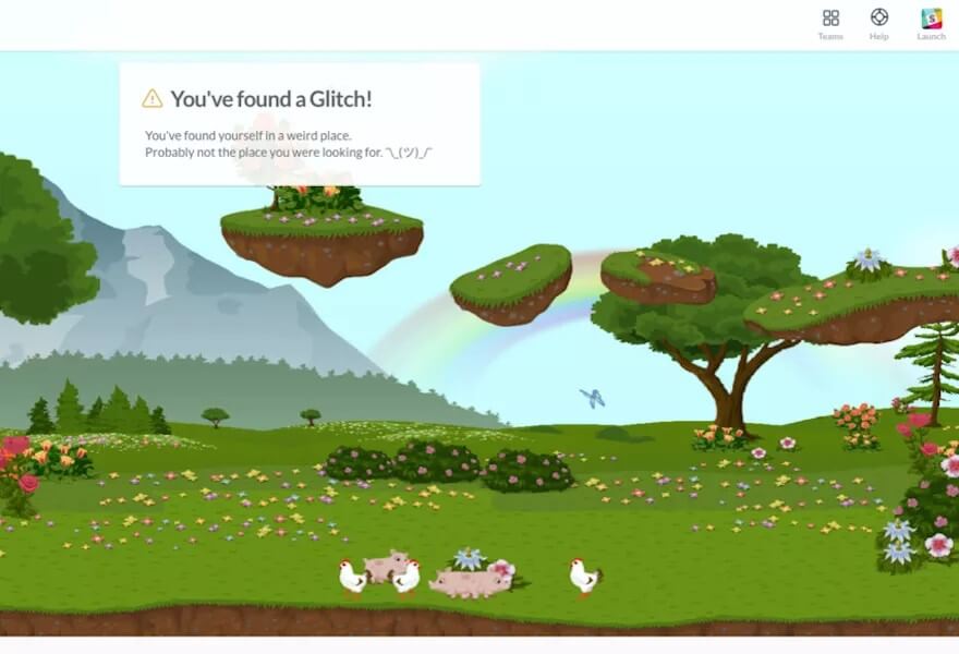
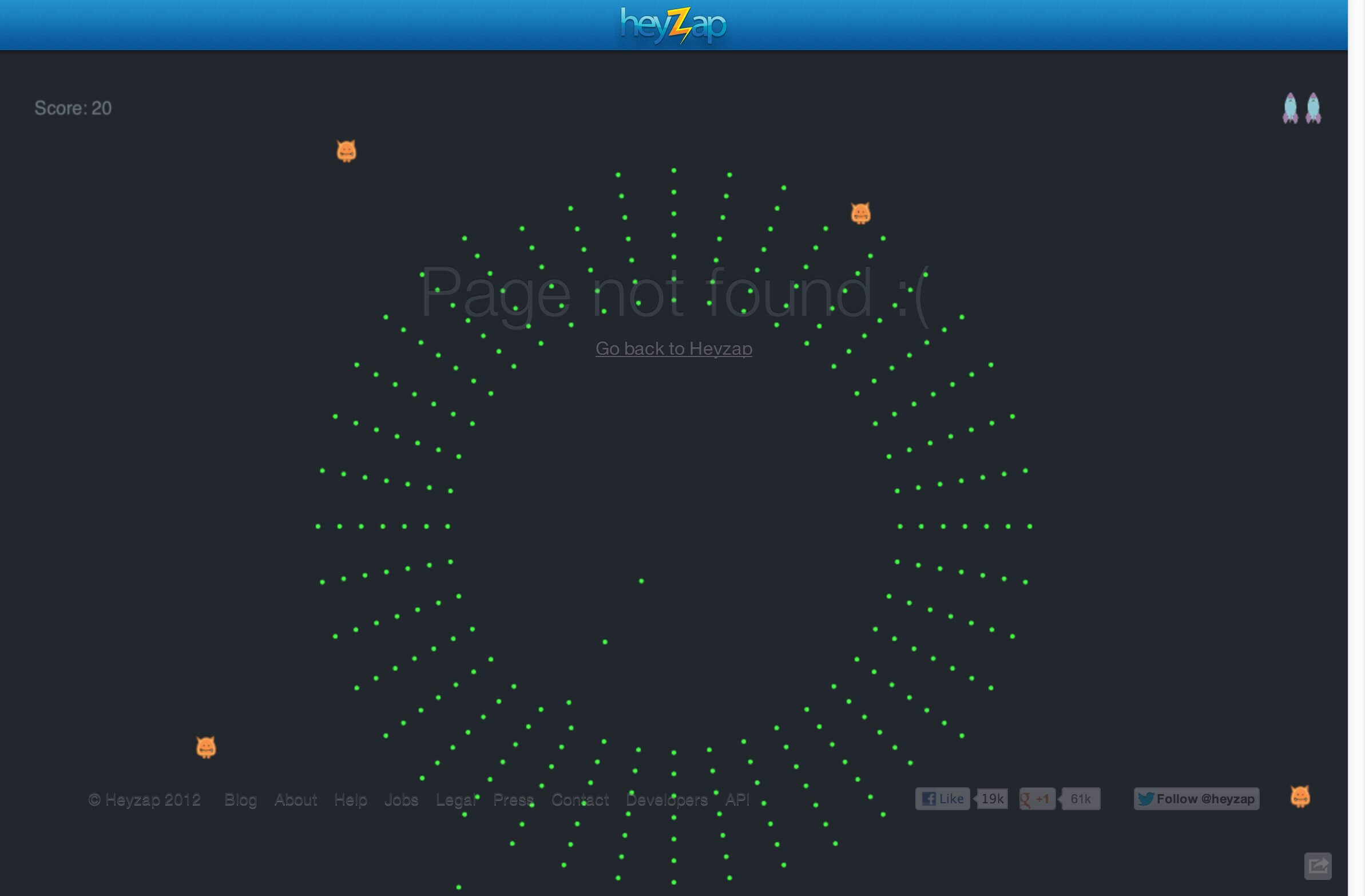
Adding more interactive elements to your 404 page can be helpful to both you and your audience. There are plenty of ways to do this, including having a game in it that makes visitors choose between options or some other way to keep them engaging with your website.
What makes any page truly interactive is the inclusion of choice. That can go from tapping into preferences to even telling a full-blown story or game.
Don’t blame the visitor for ending up reaching a 404. Instead, be apologetic and shift the blame to yourself and/or your team for having a broken link, missing content, or so on.
You can also have a two-part 404 page, wherein the interaction in the first leads to the second. It also allows you to explore more creative ideas with what you lead your visitors to within your 404 page.
404 Page with Internal Links to Recommended Posts
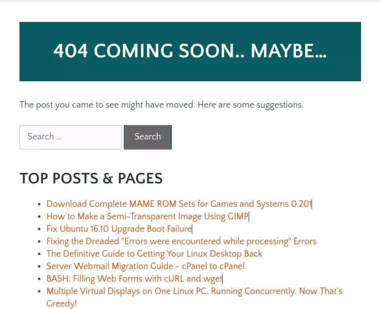
If you don’t know what to do with any sort of interactive 404 page, the best way to go about this is to have links to other content or pages in your website.
They can either be automatically generated links or featured posts you picked yourself. Whatever it is, you should make sure they’re links that people will be interested in clicking.
You can have one of the links go to your FAQ page, then maybe the rest be to your most popular or most helpful posts. Put your best foot forward with those links.
404 Page with Product Recommendations
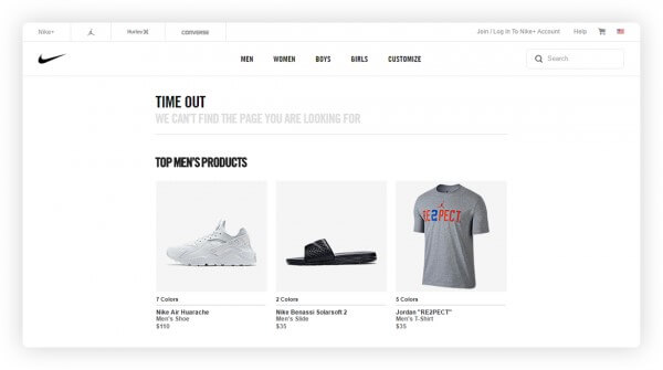
This is pretty much a 404 page with internal links as well, but with a twist.
If you’re running an ecommerce website, then you’ll most likely deal with a lot of 404 errors over time. It’s inevitable that many of your visitors will hit a 404 page. If they can’t find the product they’re looking for, they’ll most likely go elsewhere to shop.
Therefore, the best thing you can do with 404 pages if you haven’t redirected them yet is to make sure your 404 page has links for product recommendations. This will lessen the people who leave your site whenever they hit a 404 and even end up with conversions.
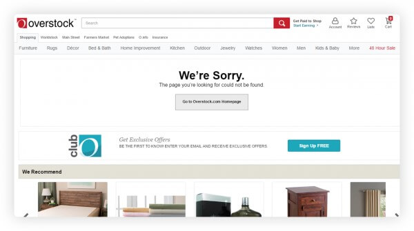
404 Page with Call-to-Action
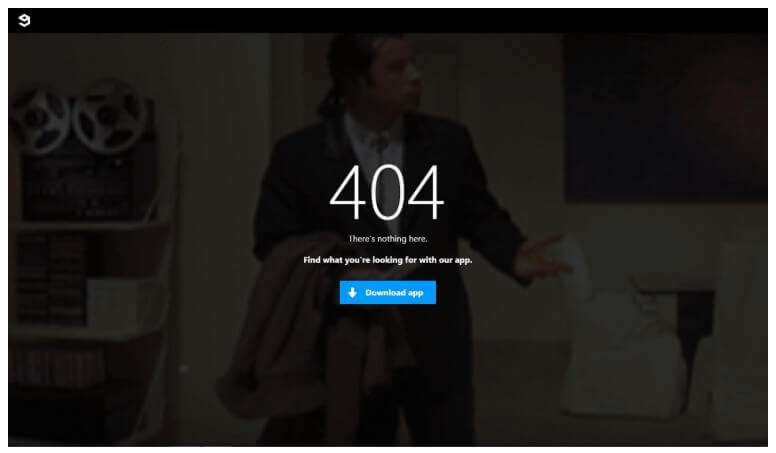
A call-to-action is any link that has you asking the audience to click to make them do something for you to bring them down through your funnel. You can have them download an app, register an account on your site, or so on.
Having a call-to-action on your 404 page can certainly help with your conversion rate. Just make sure you make it as simple as possible by having only one or two CTAs. Don’t overwhelm them with too many options or they’ll end up not clicking anything at all.

404 Page with Search Box

Most visitors who visit your website are most likely looking for something. A 404 shouldn’t be the end of their search, and you can make things easier for them by having a search box right there to aid them. That helps make your website’s user experience better.
404 Page with Lead Magnet
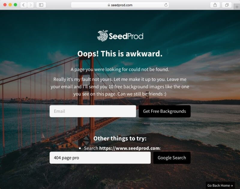
A lead magnet is like a call-to-action, but with the intention of acquiring the user’s email address or other contact information. You can get more leads that can then boost your conversion rate.
In this case, the lead magnet can be a request for the user to sign up to an email newsletter, a link to a free ebook that will then ask for an email address, or so on.
404 Page with Exit-Intent
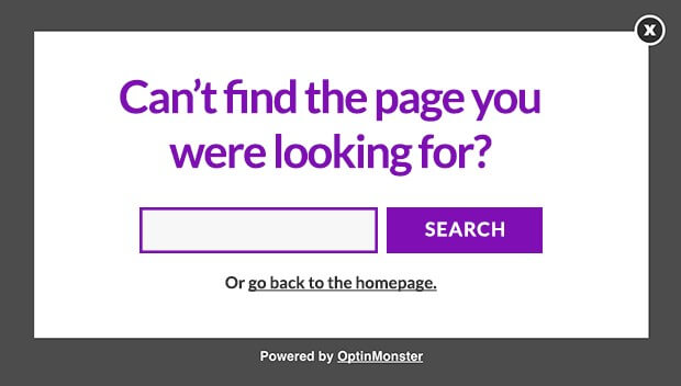
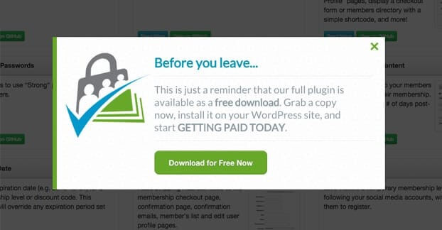
Exit-intent comes up whenever a user is about to abandon a web page—your 404 page in this case. That then triggers a pop-up at that instance in an attempt to make them change their mind right then and there.
This technique can prevent you from losing more than 70% of visitors who leave and never return. The pop-up should be something that gives users another way to find what they’re looking for.
It’s like the 404 page with a search box, but the difference is the pop-up itself, which creates a feeling of urgency. You can also offer a coupon or discount code in the pop-up to add more incentive to stick around.